Visual Identity Refresh
INDIANA UNIVERSITY
ROLE: Art direction | Design | Concept testing design | Brand education
TACTICS: Concept testing | Brand templates | Brand resource library
Our team was tasked with creating a visual identity refresh for the IU brand. Design research was a key part of the development process giving us data-backed creative direction. The identity was built to be dynamic, flexible, and easy to use for all IU marketing and communications professionals.
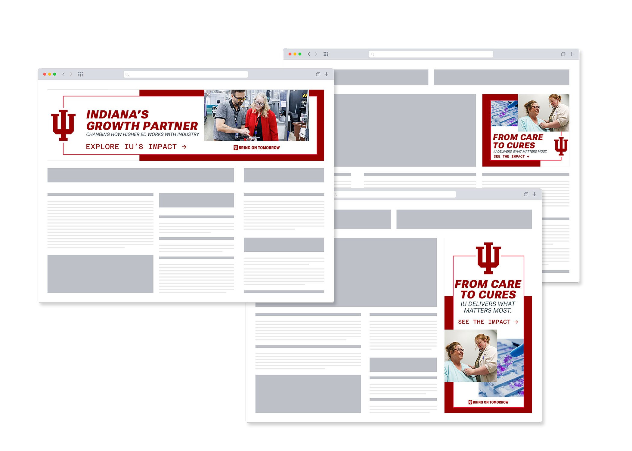
The visual update has been supported by brand education and development of a robust template and resource library for campus partners to utilize.
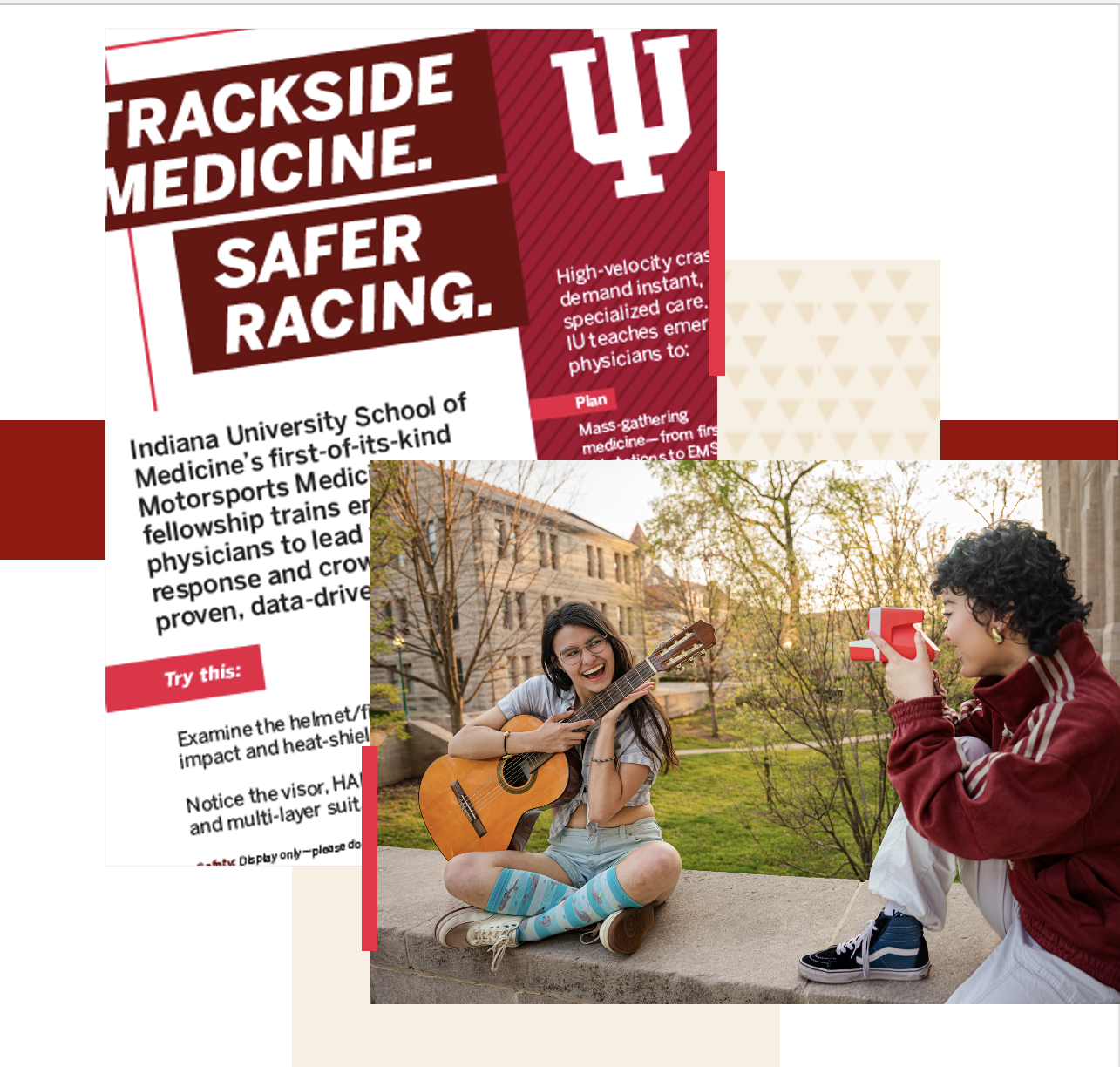
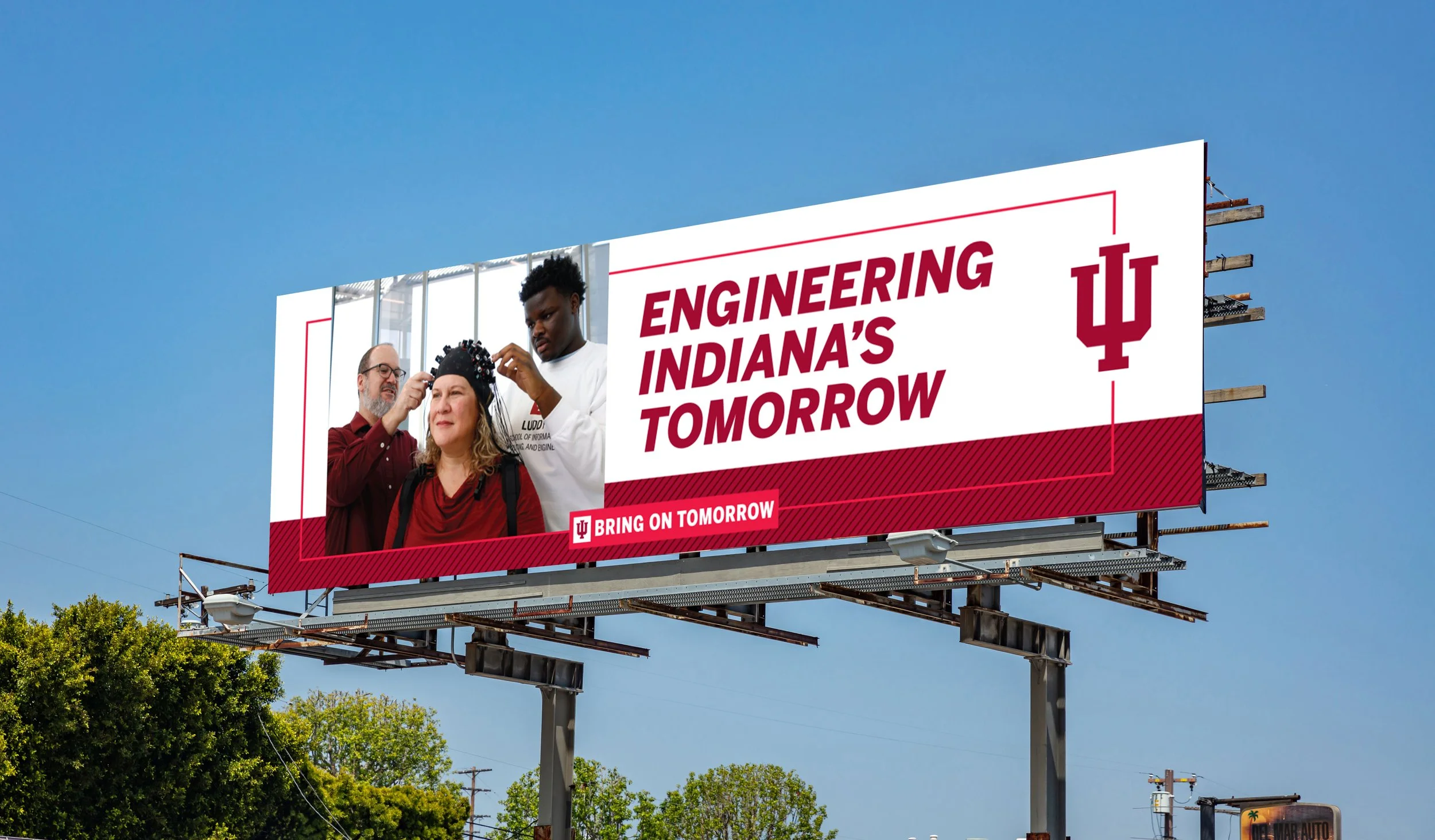
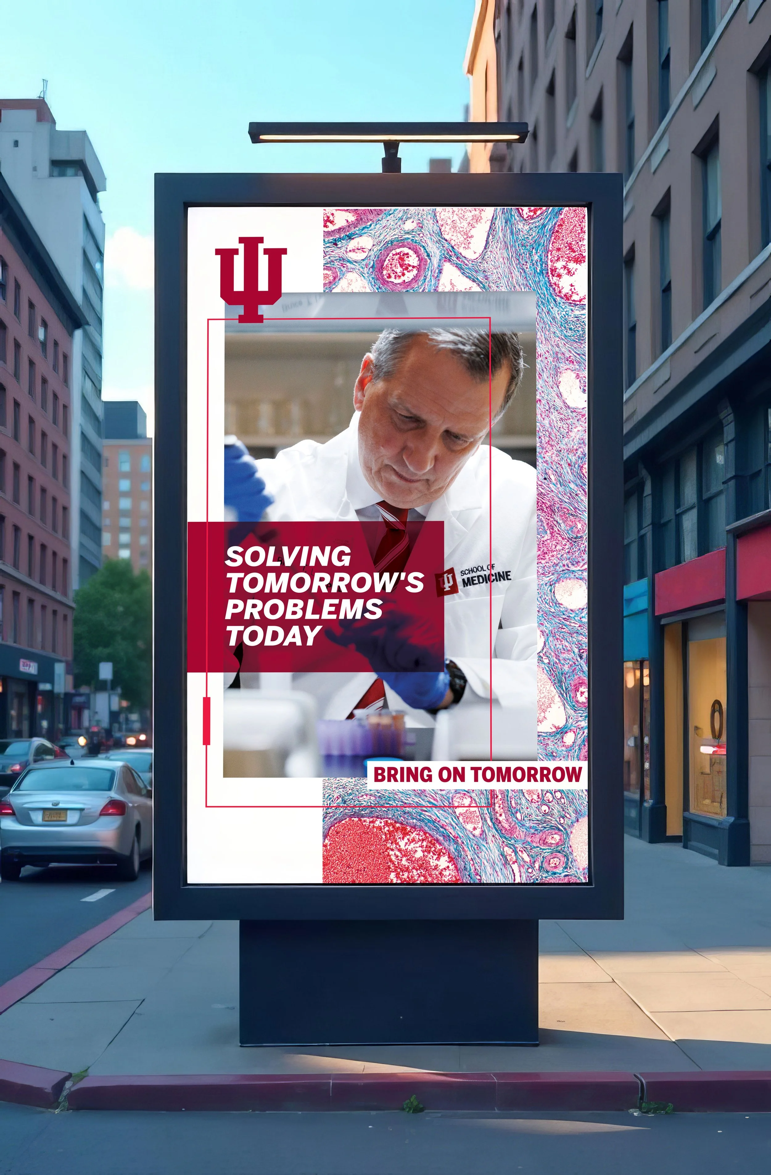
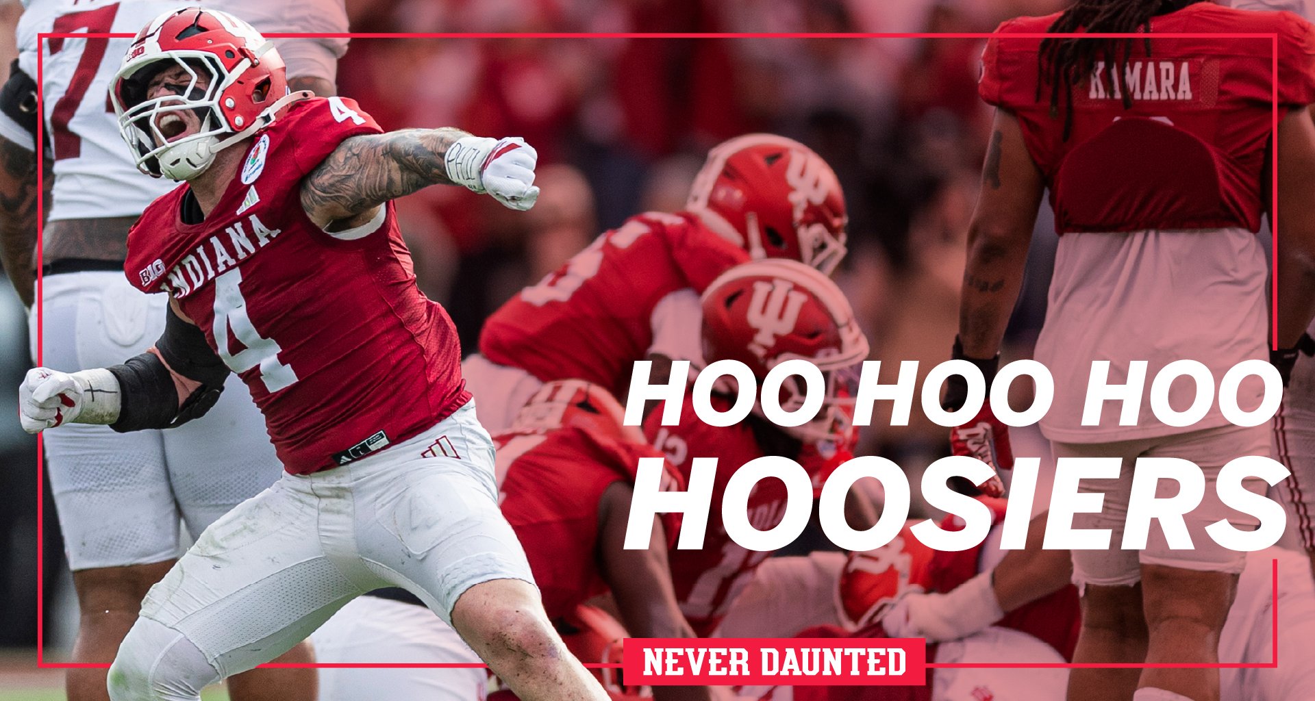
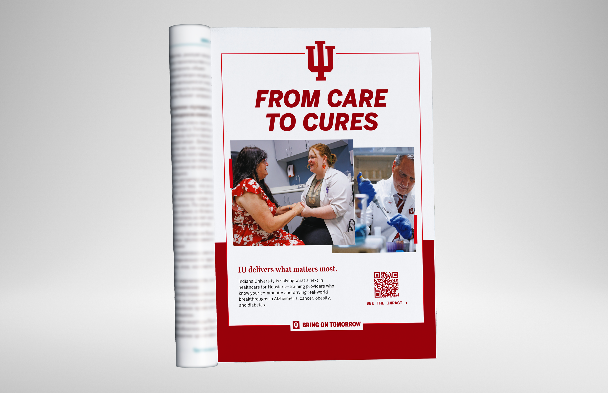
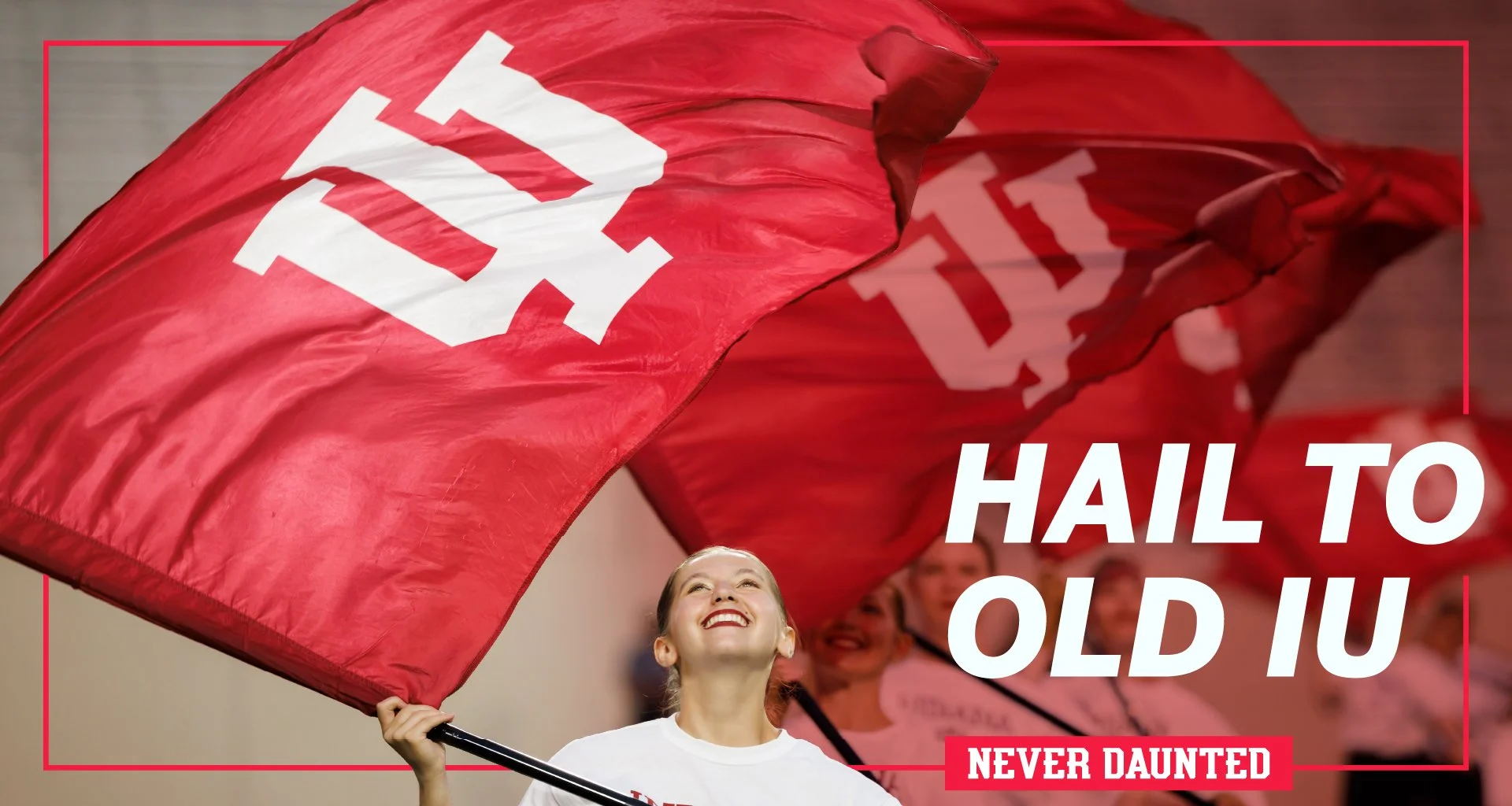
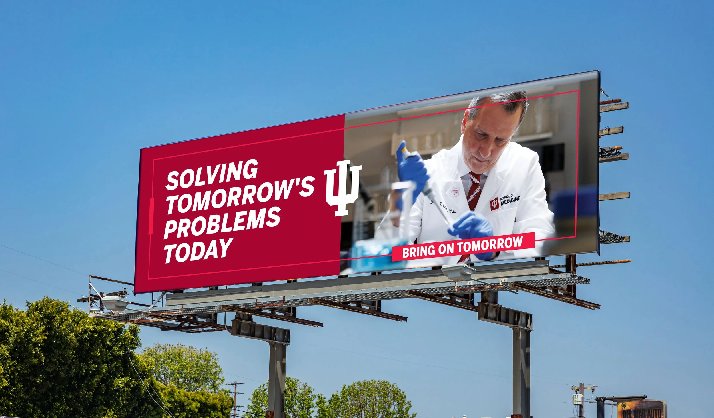
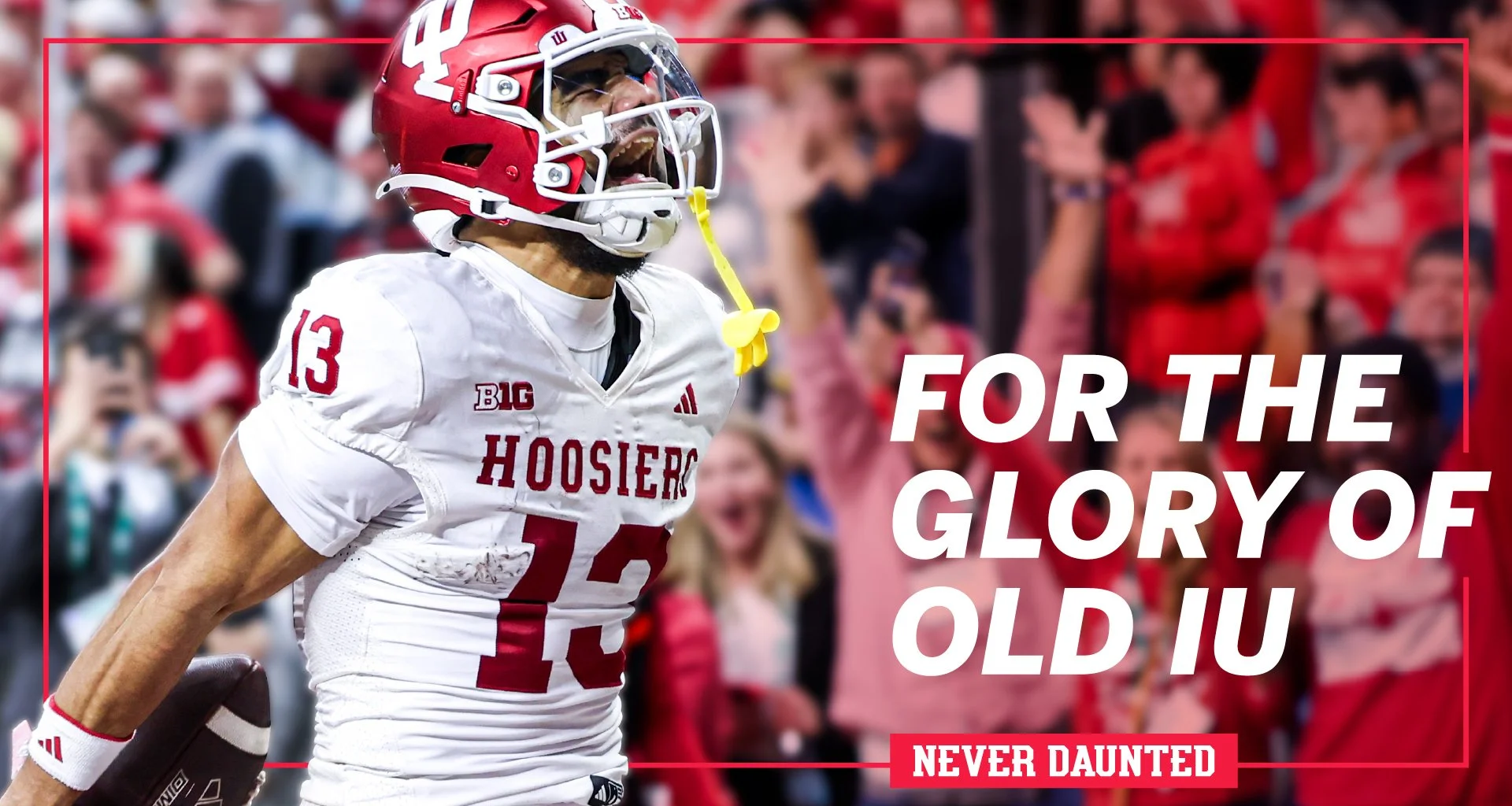
The System
IU’s design system is built to be flexible, yet consistent. Visual layering provides a platform that allows for rich and dynamic storytelling. Core elements like backgrounds split in thirds, frames, emphasis bars, patterns, and of course our brand hallmark the trident, give designers a vibrant tapestry to remix for whatever the topic, platform, or audience.
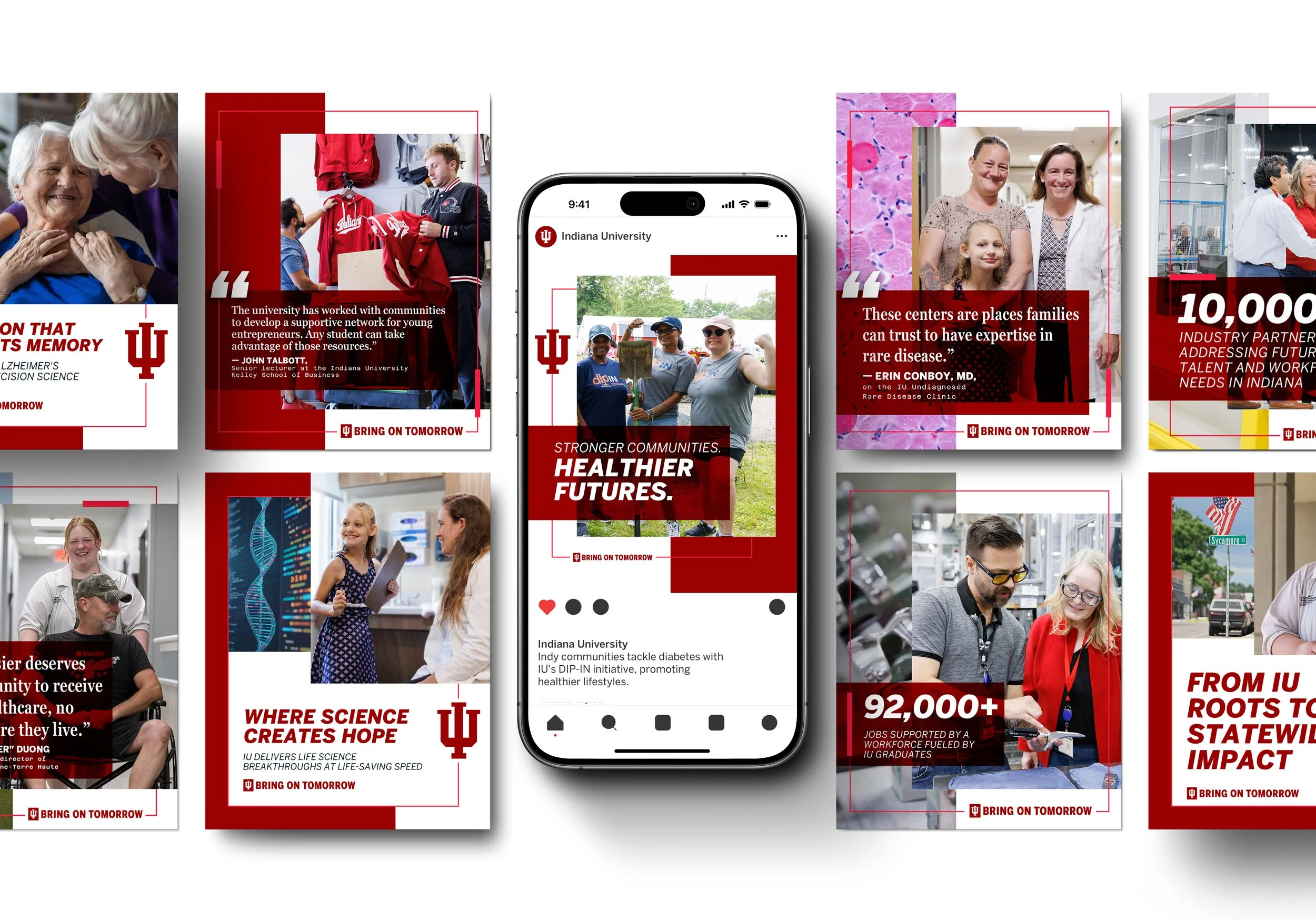
We supported the system through creating a deep library of templates and design resources that are available across platforms like Adobe Express for our untrained partners and Adobe Creative Suite tools for designers. We followed up the development of these resources with brand education and training to support longterm and widespread adoption. We’ve adopted an always-on project management approach with a regular refresh and maintenance cadence to encourage continued partner engagement.
Plans are in progress to bring together a group of cross-functional marketing professionals from across the university to inform resource needs and foster a community of co-creation.